
Using Charts and Tables to Convey Audience Composition
In market research, we often need to understand the composition of an audience. Understanding who we surveyed provides context that’s necessary to properly interpret the results. For example, we might need to know if there were more women or men in a B2C sample, or we might want to see the distribution by industry of a B2B sample.
Often, the findings can also be thought of in terms of composition. How do customers break down into promoters, passives, and detractors? How is the universe of potential customers split into segments? How are targets divided by their intent to purchase a new product concept?
You might think of these as different ways to slice the respondent pie, but pieces of a pie might or might not be the best visual metaphor. There are several ways to display audience composition, each with pros and cons. Understanding these pros and cons can help you select the chart type that will best enable your readers to see what’s important in the audience composition data.
Pie Charts Work When There Are Few Audience Categories
Pie charts make it obvious that the slices are parts of a whole. The reader immediately, intuitively understands this and doesn’t have to determine whether the numbers add up to 100%, like they might with a bar chart.
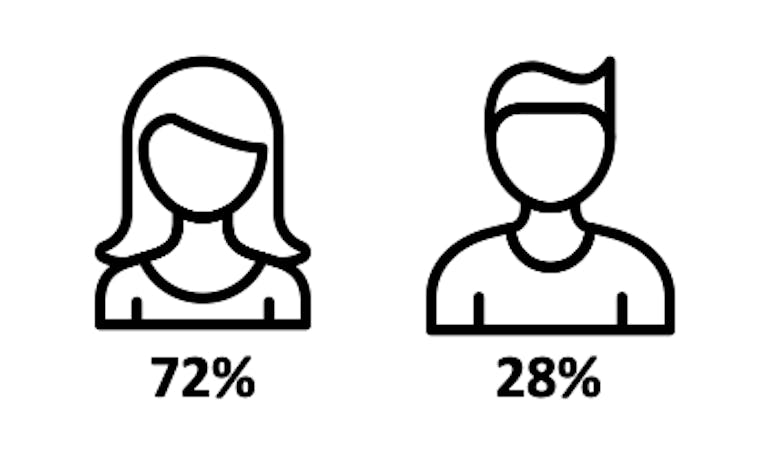
When there are a small number of categories, pie charts are easy to interpret. In the example below there are clearly a lot more women than men in the audience. The reader can even estimate that the audience includes just over one-quarter men, despite the lack of data labels.

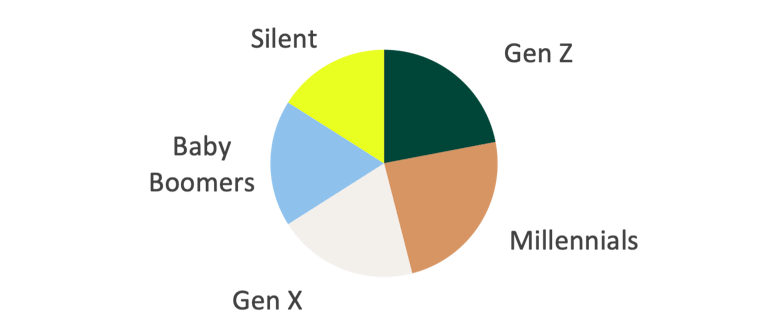
Interpretation is tougher with more categories, especially when some or all of them are similar in size. In the example below, it’s not as easy to compare the slices of the pie or estimate the size of any one slice. At a glance, one can see that all generations are roughly equally represented in the audience. However, one cannot immediately see which generation is the largest or the smallest. Human perception is much stronger at interpreting length and position than interpreting area and angle. This means pie charts can be harder to read than some other types of charts.
Bar Charts Enable Clear Comparison Between Audience Categories
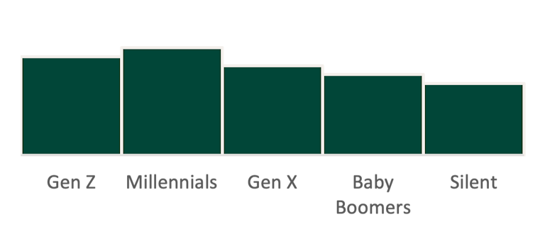
Bar charts make it easy to compare category sizes. You can see this in the chart below, which is based on the same data as in the pie chart above. Since humans are good at perceiving differences in length, we can easily see that this audience includes more Millennials than members of other generations and fewer from the Silent Generation. The downside is that it’s not as obvious that the categories are parts of a whole, although minimizing the space between the bars may provide a hint. The reader may also be able to surmise it if there are numerical data labels on the chart that they can sum to see if they tally to 100%. However, this requires more mental effort than with a pie chart.
Stacked Bar Charts Try to Split the Difference in Displaying Audience Composition
Like pie charts, stacked bar charts aim to make it obvious that the data comprises a whole, since the category representations together create a single shape – in this case, a rectangle rather than a circle. However, stacked bars do not always comprise a whole, so this is less obvious than for a pie. Also like pie charts, they make it relatively easy to see differences between few categories, as in the distribution of an audience between women and men, below. People are good at perceiving length, so can tell right away that there are more women than men.

However, this is not always true. In the example below, it is much easier to see that there are slightly more small than large companies in the pie chart than in the stacked bar chart. When the categories are stacked, it’s harder to estimate the differences between them, unlike bars that are next to each other and share a common baseline.


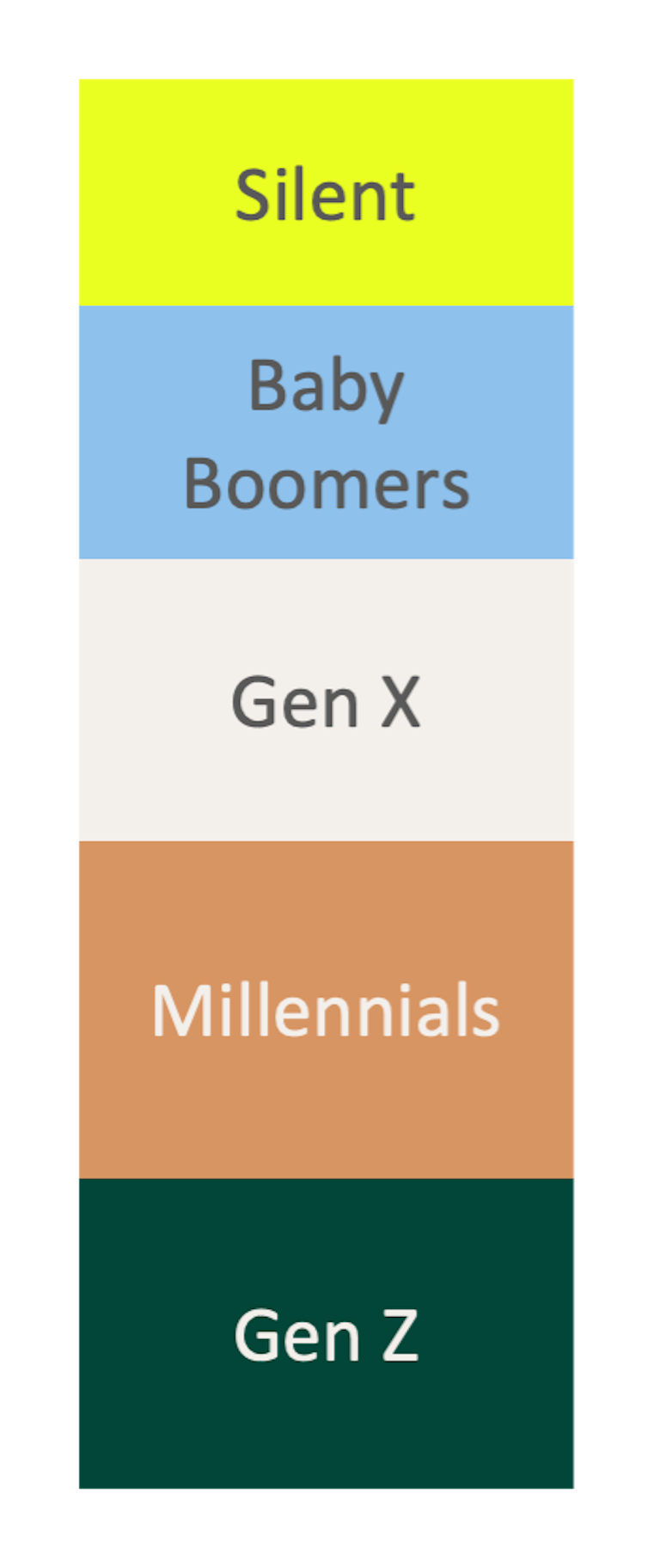
Also, like pie charts, it’s relatively difficult to discern differences when there are more categories. The generational distribution below is not any easier to interpret than in the pie chart of the same data.
A benefit of stacked bars is that they are compact. They fit a lot of data, relatively speaking, into a single rectangle. The downside, as discussed, is that it is relatively difficult to compare the sizes of the categories. Overall, they do a great job of providing a rough understanding of audience composition in a small space. Additionally, they work well to compare Likert scale results across attributes, brands or subgroups.
Tables Provide the Details of Audience Composition in a Compact Space
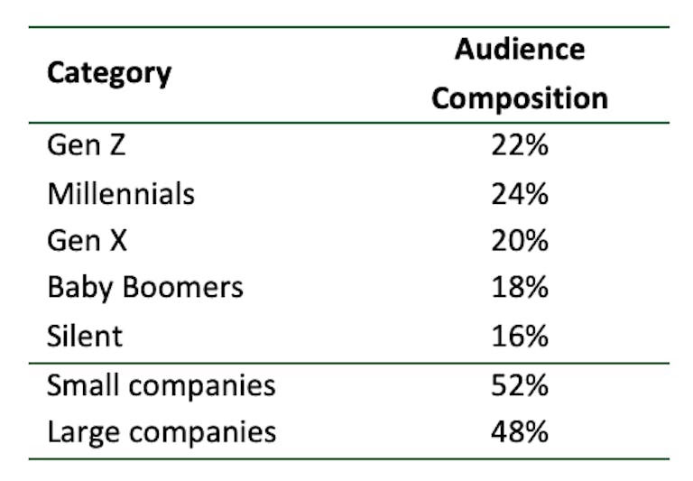
Lastly, a table is always an option. Numerical data labels were not included on the charts above for simplicity and to make a point. However, labels are helpful to include, so the reader not only has a visual representation of the audience composition, but also access to the exact numbers. A table is another way to facilitate that access, though the shortfall is that a table does not help the reader quickly see what the distribution looks like. Tables are a good choice for data that is not critical to the story you aim to tell, but that your readers might want to dig into for more information, e.g. in an appendix. They allow presentation of detailed data in a small space.
In the tables below, one must read and think about the numbers to understand the audience composition, whereas one can see the distribution at a glance with any of the chart types. Even where icons provide a visual representation of what the categories are, for example women and men, they don’t necessarily encode any information about the relative sizes of those categories. Tables may slake your curiosity about what the numbers behind the charts are and can satisfy stakeholders that want all the details at their fingertips.
Choose Chart Types Thoughtfully to Visualize Audience Composition
There is no single chart type that is always the best choice to visualize audience composition data. When selecting a chart type, consider:
- What you want your reader to take away, whether it’s a compact overview or the ability to interrogate small differences.
- The shape of your data, meaning the number of categories and their relative sizes.
- The pros and cons of the options in making it clear that the categories are parts of a whole, and making it easy to discern differences between category sizes.
At Big Village, we employ visual storytelling to ensure our clients can easily digest our research findings and understand what is important for their decision making and action planning. We take care in selecting data visualizations that help our clients quickly grasp the context of the findings and easily assess what the findings mean for their business.
Written by Ashley James, Vice President at Big Village Insights.